Barry Lyndon
A Movie or a Walk Through a Gallery?

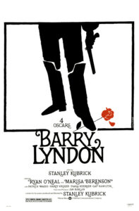
Stanley Kubrick directed, in 1975, the costume drama Barry Lyndon. Adapted from William Thackeray’s novel, the movie tells the story of the rise and fall of an Irish rogue who, after going to war, marries a rich widow. His life in nobility is characterized by a messy relationship with his stepson, his infidelity to his wife and the death of a biological son. The two parts are clearly divided. “By What Means Redmond Barry Acquired the Style and Title of Barry Lyndon” is all about his ascension in the world. “Containing an Account of the Misfortunes and Disasters Which Befell Barry Lydon” finishes with a lost duel that casts Barry back to his former life.
To give an authentic context, Kubrick seeks inspiration in 18th-century paintings. While the eyes are the window for the soul, for Kubrick, paintings become detailed windows to the past. To a beautiful, aesthetic past. If you ever fancy watching the movie, don’t expect the adventure of a rogue. What you should expect is to be mesmerized by extremely aesthetic shots.
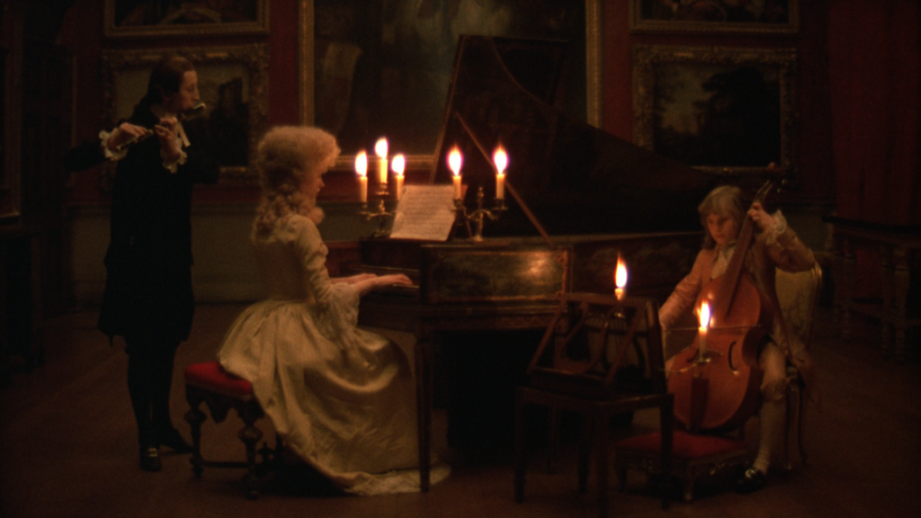
The director used works of art as a way to immerse back into the 18th century. He wanted to use light as a way to emulate those scenes from the past. It would not only give an authentic look to the film, but it would also provide colour and light with meaning. In an interview, photographer John Alcott reveals that Kubrick used actual locations and natural lighting. None of the sets was built: the rooms and houses were actual locations in Ireland and Southwest England. Special cameras and strategic angles were used to capture the images. And in the night scenes, the only source of light was an absurd amount of candles… Talk about going back in time.


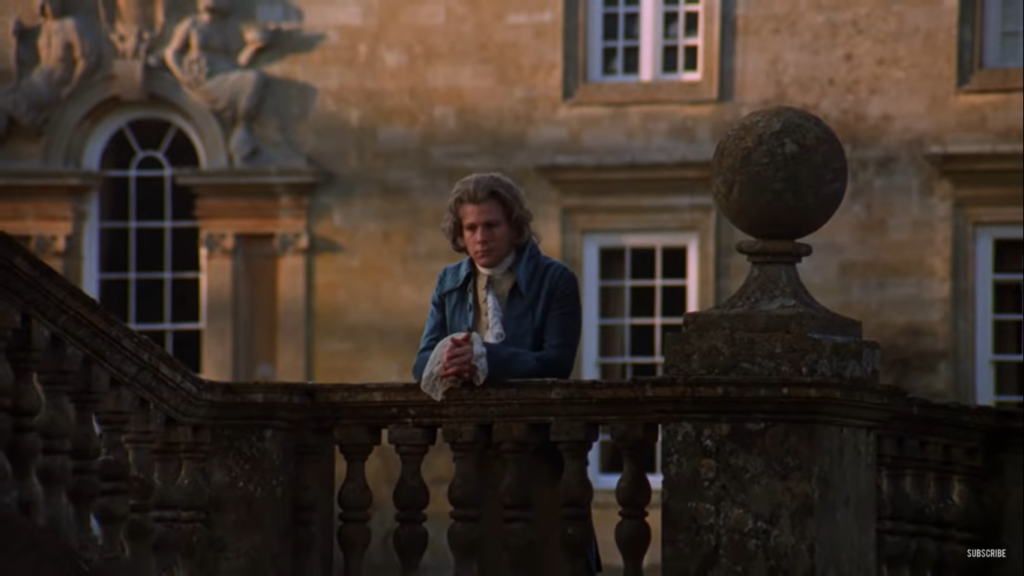
If you are playing with lighting, it is only natural that colour should also be a preoccupation. In the first half of the movie, tonalities of brown, red and green are widely used. It is all about the rise of the character. Vibrantly young and ambitious, the colours mirror the character’s path and personality. But in the second part, blue and grey dominate the screens to reflect the decline of Barry. A remarkably pivotal scene is one in which Barry stands alone after a public fight with his stepson. The fixed, highly symmetric shot strikes our eyes. As if in a portrait, the character stands in a pose. It is a true piece of self-contained art. We have a clear sense that the protagonist is trapped in unfulfilled disillusions and failed dreams. This painting-like shot is a pause in the narrative before the inevitable fall.

All those aesthetic elements are there to impress us. Both the vibrant and the cold parts are just as beautiful in different ways. The constant use of zoom outs keeps us fixated on the beauty of the scenes. It creates a distance between us and Barry. The beauty here is a tool. But while it prevents us from looking deep into a character, it informs us about an ineffable inner state. The images represent on the outside what is happening on the inside.
For Kubrick, the use of the past helps his analyses of human nature. The director uses something concrete – the painting effect – to try to represent a concept on the screen. His goal is to best illustrate the idea of “men”. Born perhaps in the time of the paintings that serve as inspiration for Kubrick, Barry Lyndon is the search for the nature of the modern human, placed on a distance between vibrant passion and cold reason, between the rise of a man and his decay, between the distance of a beautiful scene and the chaotic storm happening inside of us.
Do you want to double-check the information you just received? Here are the sources the writer used.
Sight and Sound by Benjamin Ross (1995)


